
How to design for a long and thin room

Our living styles have evolved. The days of dedicating a room per function have long since gone and we now crave open plan living, with many renovation projects knocking walls down or extending into the garden.
The result can be lovely, creating light and airy family rooms but (especially in our older, terraced or semi-detached housing stock), this can create long thin rectangular spaces often lacking in architectural interest.
In this instance design success relies on considered zoning; if you simply place furniture along walls, you exacerbate the corridor effect, and nobody wants a home that feels like a waiting room!
To create successful zones, focus on the following three areas:
Think Floor!
Use a scale-plan to work out furniture placement. If you have architectural features, such as a fireplace or side windows then great - use them to anchor your zones; if not then create new focal points using furniture placement - a sideboard, a large mirror or a TV/media station (let’s be honest, this is what most of us do in our living rooms)!

Break up the space by positioning furniture widthways, a centrally placed sofa, or a corner sofa in the middle of a long wall work brilliantly. Add a console table along the back of the sofa, this helps visually and psychologically … to stop the hairs on the back of your neck reacting to scary films.
If your room width won’t take a sofa, then an armchair at the right angle can effectively define the edge of your seating area.

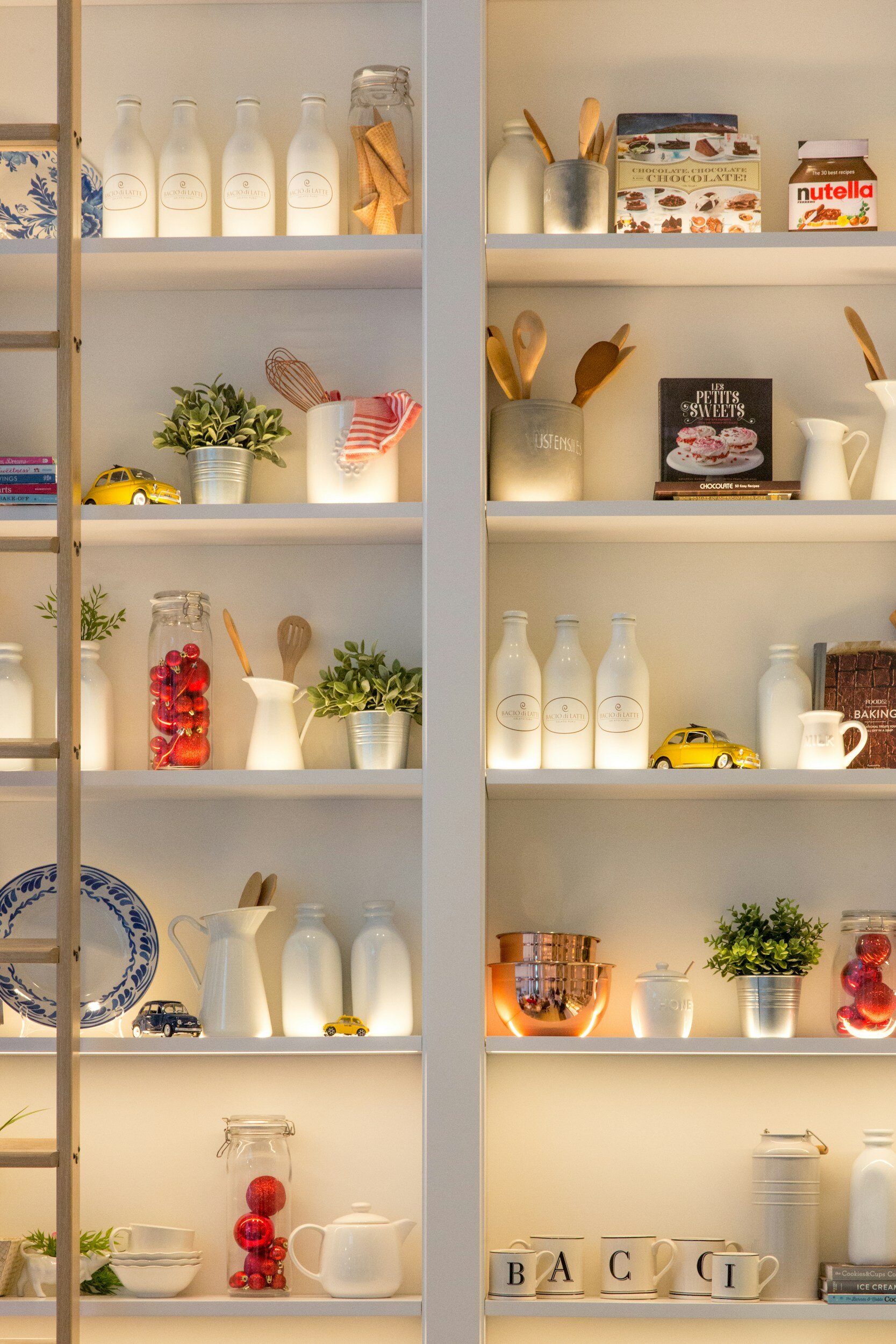
Open shelving units can add a ‘broken plan’ effect to your living space; allowing light through but adding division - especially good if your room incorporates an office zone.
Curves are great; circular or oval coffee tables can visually break up the rectangular-ness of your room, and when space is tight are easy to navigate (as you top-up your guest’s glasses).
Flooring can have a big impact; a change from tile to wood between cooking and living areas is an obvious one. Or simply adding rugs - easy as pie! If your space needs more than one rug, go for a mix of textures, colours and shapes; it will better define your zones, so don’t be tempted to be too ‘matchy-matchy’.
And of course, plants; the final garnish to every scheme, especially important when connecting your living space with your garden. A well-placed floor plant outlines a zonal corner whilst drawing your eye to the window and garden beyond.

Think Walls!
Starting with the biggest no-no; do not fully wallpaper one long wall - this will only make your space appear longer and thinner - instead find a way to break it up. Panelling, wallpaper, paint - all of these will work and add immense visual impact.
Colour blocking is one of the simplest and more contemporary ways to achieve this. On one of my recent rectangular extension projects we took a colour block on to the ceiling. This worked well with the rooms’ many skylights and helped make sense of a flue access; instead of trying to hide this (which would have been impossible) we made it a feature of the colour blocking with some added trim. See [HERE] for the full design.

Think Ceiling!
Make use of skylights to decide where your zones should be. Getting natural light into the room is essential but be careful to avoid putting an office workstation in a position that can’t be protected from mid-summer rays.
And let’s not forget lighting, the make or break of any design scheme. So many kitchen extensions come filled with down-lighters - the most unflattering, harsh lights that are only useful when hoovering … if you ask me!
Of course, lighting positions aren’t just confined to ceilings; use table lights, floor lamps and light shelving to make a feature. In general aim upwards, directing light up so that it bounces off your ceiling creates an ambient and atmospheric effect - perfect for your dinner parties.
If you need help with your rectangular space (however long and thin) say hello by [clicking here] and I’ll give you a call.